Block: Cards
This block lets you add content to your pages in the form of cards, which include an image, a small title, and text.
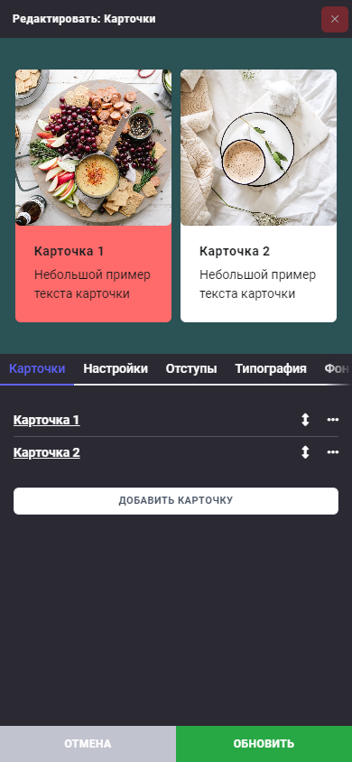
In the "Cards" tab, you will find a list of all available cards. To change the order of the cards, you can use the icon and drag them up or down. In the options menu , you can edit, duplicate, or delete a card.
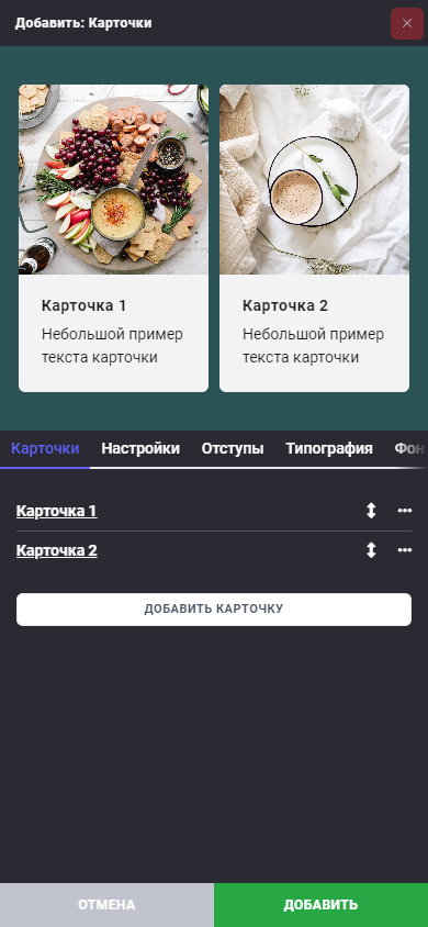
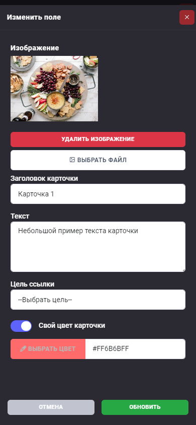
In each card, you can change the image, title, and text. You can also choose a link for the card that will open when it is clicked.
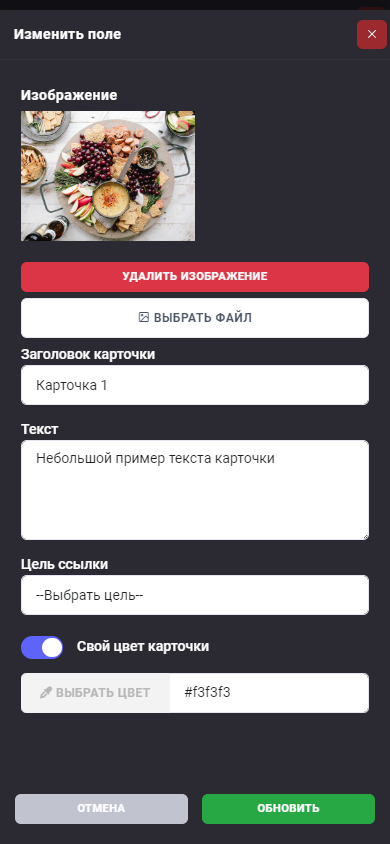
In addition, you have the option to set a separate color for the card so that it stands out from the others.
Let's look at the "Settings" tab:
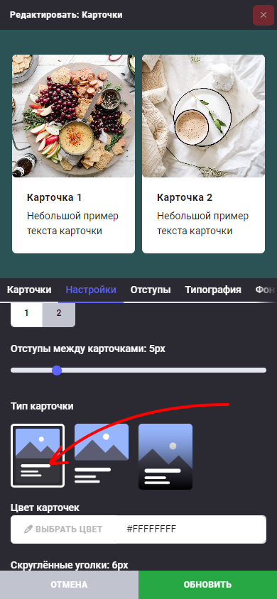
In the "Card Settings" section, you can customize the appearance. Choose the number of card columns - 1 or 2, and also set the spacing between them.
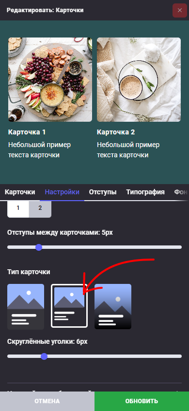
Select the card type:
The first type is an image and text in one container. Here you can adjust the card color.
The second type is an image followed by text.
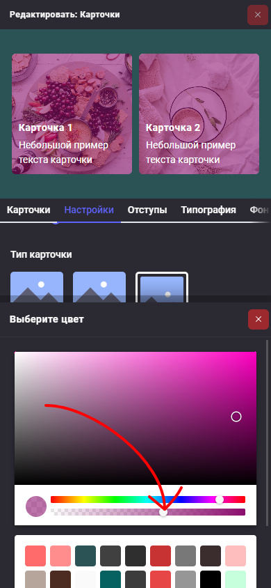
The third type is text overlaid on an image. Here you can adjust the fill type and color so that the text is clearly visible against the image background.
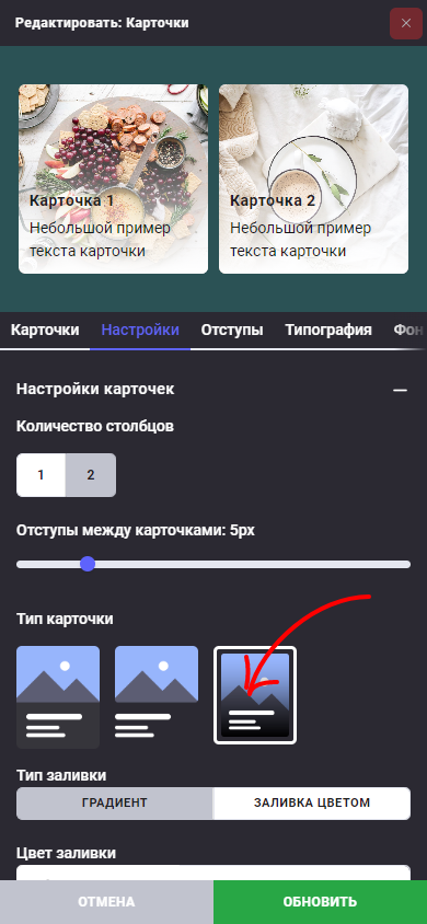
If you selected the fill type "Color Fill", don't forget to set the color transparency.
Next, you can set the corner radius for the cards.
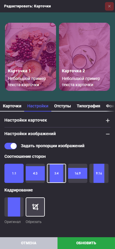
In the "Image Settings" section, you can choose the aspect ratio and cropping of images to ensure a consistent style for the card grid. You can also set the corner radius for images here.
To make your "Cards" block more attractive, use additional tabs such as "Spacing", "Typography", "Background", and "Effects".
Don't forget to save your changes by clicking the "Update" or "Add" button.